
Chart Nodes
Chart Nodes
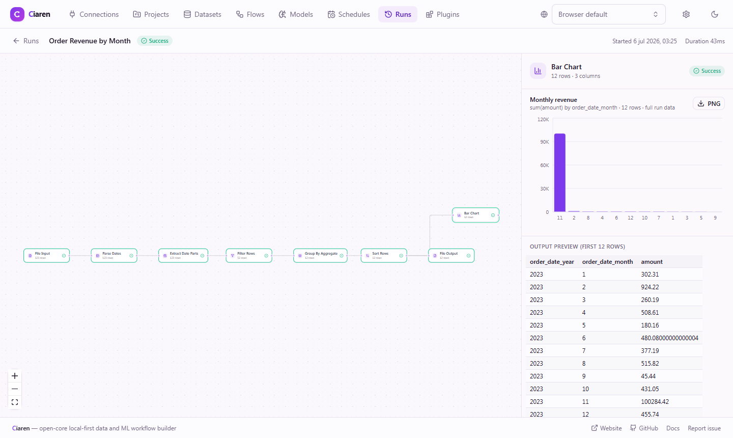
Chart nodes turn a step of your pipeline into a chart that is saved with every run. They appear under Charts in the palette. Each one is a pass-through: the dataframe flows out unchanged, so you can drop a chart anywhere in the middle of a pipeline — or end a flow with one (a flow that ends in a chart node is complete without a file output).
When the flow runs, the node aggregates the full data (not a preview sample) into a compact chart artifact and stores it on the run. Opening the run later renders the stored chart instantly — nothing is recomputed — and every chart can be exported as a PNG from the run page.
Charts vs. the Data Preview
The editor's Data Preview panel also draws charts, but from a capped sample while you explore. Chart nodes are the production version: computed over all rows at run time, versioned with the run, and exportable. Use the preview to explore; add a chart node when a chart is part of the result.
The eight chart nodes
| Node | type | What it shows |
|---|---|---|
| Bar Chart | chartBar | A value aggregated per category — optionally stacked by a second column, vertical or horizontal |
| Line Chart | chartLine | One or more measures over an ordered axis (dates or numbers) |
| Area Chart | chartArea | The line chart with a filled area — volumes over time |
| Scatter Plot | chartScatter | The relationship between two numeric columns |
| Pie Chart | chartPie | Each category's share of a total (donut, top slices + Other) |
| Histogram | chartHistogram | The distribution of a numeric column in equal-width bins |
| Box Plot | chartBoxPlot | Five-number summary of a numeric column, optionally per group |
| Correlation Heatmap | chartHeatmap | Pairwise Pearson correlations between numeric columns |
Adding a chart to a flow
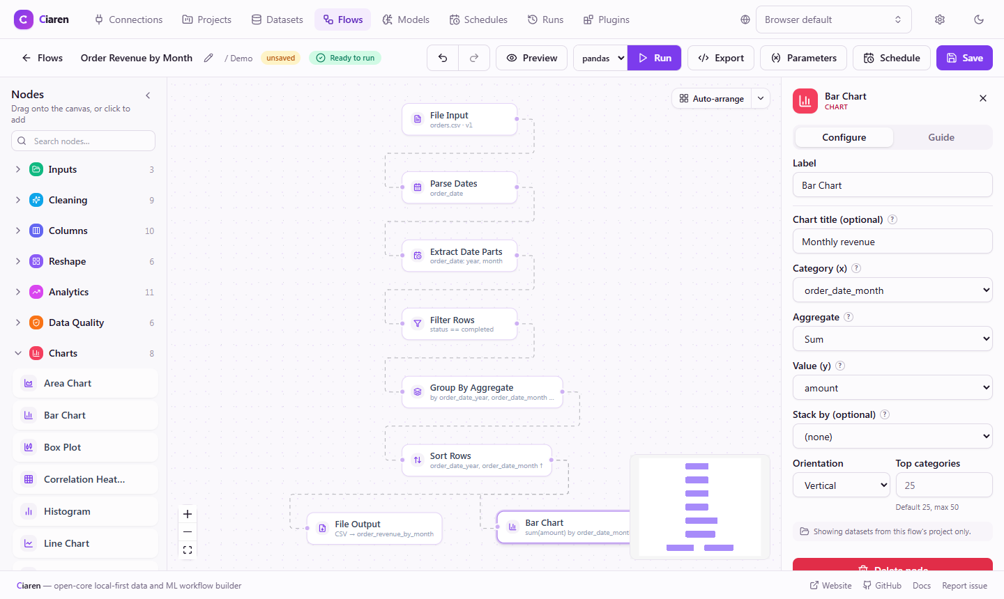
- Expand Charts in the node palette and drag a chart onto the canvas (or click to place it).
- Wire any dataframe output into it. The column pickers fill in from the incoming schema.
- Configure the chart, then Run the flow.
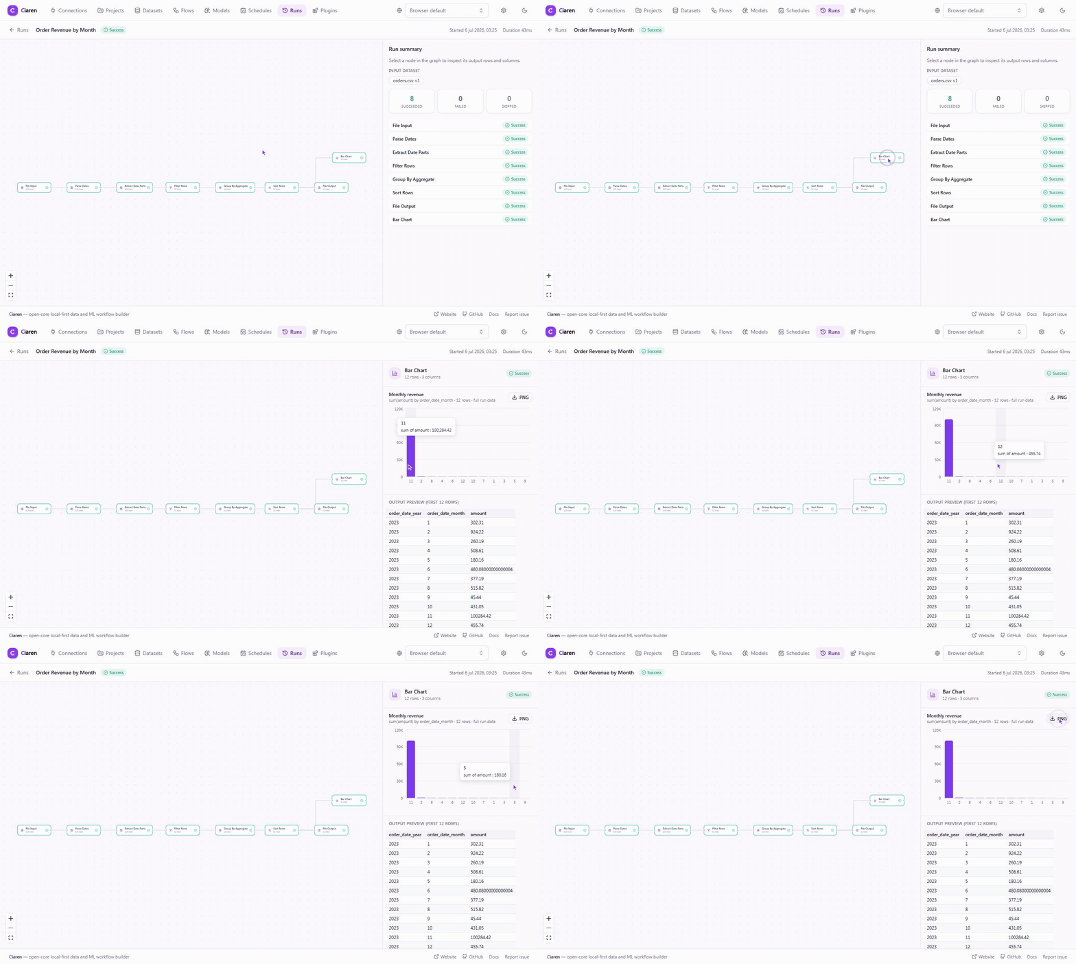
- Open the run and select the chart node — the chart renders in the inspector with an Export PNG button.
On the finished run, the chart is one click away — hover for exact values, export when it looks right:
Configuration
Every chart node accepts an optional Chart title — it heads the chart on the run page and becomes the exported image's heading. Left empty, the node's label is used.
Bar Chart — chartBar
| Config key | Type | Required | Description |
|---|---|---|---|
title | string | No | Chart heading (defaults to the node label) |
x | string | Yes | Category column — one bar per distinct value |
aggregate | sum | mean | count | min | max | median | No | How rows in a category combine (default sum) |
y | string | With any aggregate except count | Numeric value column |
group_by | string | No | Second category: splits each bar into stacked segments (up to 8 series) |
orientation | vertical | horizontal | No | Horizontal fits long category names (default vertical) |
limit | integer 1–50 | No | Top categories shown, by value (default 25) |
Line / Area Chart — chartLine / chartArea
| Config key | Type | Required | Description |
|---|---|---|---|
title | string | No | Chart heading |
x | string | Yes | Order column — dates and numbers sort chronologically/numerically |
y_columns | list of strings | Yes | Up to 8 measures, one line/area each |
aggregate | aggregate | No | Rows sharing an x value combine with this (default mean; use sum for e.g. revenue per day) |
Scatter Plot — chartScatter
| Config key | Type | Required | Description |
|---|---|---|---|
title | string | No | Chart heading |
x, y | string | Yes | Two different numeric columns |
Pie Chart — chartPie
| Config key | Type | Required | Description |
|---|---|---|---|
title | string | No | Chart heading |
category | string | Yes | One slice per distinct value |
aggregate | aggregate | No | Default count (share of rows) |
value | string | With any aggregate except count | Numeric value column |
limit | integer 2–12 | No | Slices shown before folding into Other (default 6) |
Histogram — chartHistogram
| Config key | Type | Required | Description |
|---|---|---|---|
title | string | No | Chart heading |
column | string | Yes | Numeric column whose distribution is shown |
bins | integer 1–100 | No | Equal-width buckets (default 20) |
Box Plot — chartBoxPlot
| Config key | Type | Required | Description |
|---|---|---|---|
title | string | No | Chart heading |
column | string | Yes | Numeric column each box summarizes |
group_by | string | No | One box per group; the 12 largest groups are shown |
Whiskers span the most extreme values inside the 1.5 × IQR Tukey fences; outliers beyond them are counted in the tooltip, not drawn.
Correlation Heatmap — chartHeatmap
| Config key | Type | Required | Description |
|---|---|---|---|
title | string | No | Chart heading |
columns | list of strings | No | Columns to correlate. Empty = every numeric column (up to 12) |
Chosen columns that turn out non-numeric or constant are skipped and named in a note under the chart. With fewer than two usable numeric columns the node records an empty chart (the run still succeeds).
How the data is kept small
The chart is computed over every row the node received, then capped so the stored artifact stays compact and readable:
- Bar: top 25 categories by value (configurable up to 50); the rest are
re-aggregated from the raw rows into an Other bucket, so even
meanandmedianstay exact. Stacked bars cap at 8 series the same way. - Pie: top 6 slices + Other (configurable up to 12).
- Line/area: up to 1 000 points per series, evenly sampled along x.
- Scatter: up to 2 000 points, evenly sampled.
- Box plot: the 12 largest groups. Heatmap: up to 12 columns.
The chart always says what was capped — "Showing top 25 of 118 categories" —
and rows_seen records how many rows went in.
Behavior
- Pass-through. The output frame is byte-for-byte the input frame; chart nodes never change your data, write files, or touch the network.
- A valid flow terminal.
input → … → chartBaris a complete flow; the chart is the result. You can also keep transforming after the node. - Stored with the run. The artifact lives in the run's per-node results, so charts from last month's scheduled runs are still there, computed from the data of that run.
- Engine-agnostic. Works identically on the pandas and polars engines.
- Previews skip it. While editing, the node passes data through without computing the chart — use the Data Preview panel to explore interactively.
Generated Python code
Chart artifacts are rendered by the Ciaren run view, so the exported script treats the node as a pass-through and your data logic is unaffected:
# chartBar: chart is rendered in the Ciaren run view (no code equivalent)
df_2 = df_1
Tips & common mistakes
- Aggregate before charting only if you need to. A Bar Chart already
groups and aggregates internally —
sum(amount) by regionneeds no upstream Group by + aggregate. - Line charts combine duplicate x values. Rows sharing an x value are
merged with the node's aggregate — pick
sumfor totals per day,meanfor averages. countneeds no value column. Pick the Count rows aggregate on a bar or pie chart to chart frequencies directly.- Set a Chart title for shareable images. The exported PNG uses it as the heading, with the chart's definition ("sum(amount) by region · 12 rows") as the subtitle.
- Charts on a run page render from stored data — if you edit the flow's chart config afterwards, existing runs keep the chart they were run with.
See also
- Visualizations in the editor — sample-based preview charts while you build
- Projects & Runs — where run charts live
- Group by + aggregate · Extract date parts