
Visualizations
While you build a flow, you can chart the output of any node without leaving the editor. Visualizations are for inspection — spotting distributions, outliers, trends, and relationships as you clean — not a pipeline output. They add nothing to the graph and are never written to a file.
How to chart a node
- Open a flow in the editor and select a node on the canvas.
- Open the Data Preview panel at the bottom and click Chart.
- Pick a chart type and the column(s) to plot.
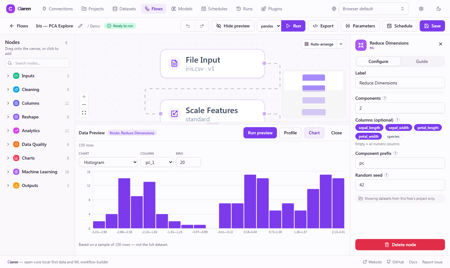
The chart renders instantly. Switching chart type or columns is immediate — it re-draws from the data already loaded, so there's no waiting.
Chart types
The picker groups chart types the same way this reference does:
| Type | What it shows | Inputs |
|---|---|---|
| Histogram | Distribution of a numeric column | column, bin count |
| Box plot | Median, quartiles, and outliers of a numeric column | value, optional group-by column |
| Value counts | Frequency of each distinct value | column |
| Bar | A value aggregated by category | category (x), value (y), aggregate |
| Horizontal bar | Same as Bar, with the axes flipped (long category labels) | category (x), value (y), aggregate |
| Stacked bar | A value aggregated by category, split into sub-groups per bar | category (x), value (y), aggregate, group |
| Pie | A category's share of a total | category (x), value (y), aggregate |
| Line / time series | A value over an ordered axis | x axis, y value |
| Area | A value over an ordered axis, filled | x axis, y value |
| Scatter | Relationship between two numeric columns | x, y |
| Correlation heatmap | Pairwise Pearson correlation | all numeric columns in the sample |
Charts are based on a sample
Sample, not the full dataset
Charts are computed in your browser from the node's preview sample — a capped number of rows, not the entire dataset. Every chart shows a caption like "Based on a sample of N rows — not the full dataset."
This matters most for the correlation heatmap: a Pearson value on a sample can differ from the correlation over all the data. Treat the charts as a quick look for exploration, then run the flow to compute final results.
The sample is the same one the Data preview shows, just drawn as a chart, so what you see lines up with the table view.
Want the chart over ALL the data? Use a chart node
Preview charts are for exploring. When a chart should be part of the result, add a chart node from the Charts palette category instead: it computes the chart over the full data when the flow runs, stores it on the run, and lets you export it as a PNG from the run page.
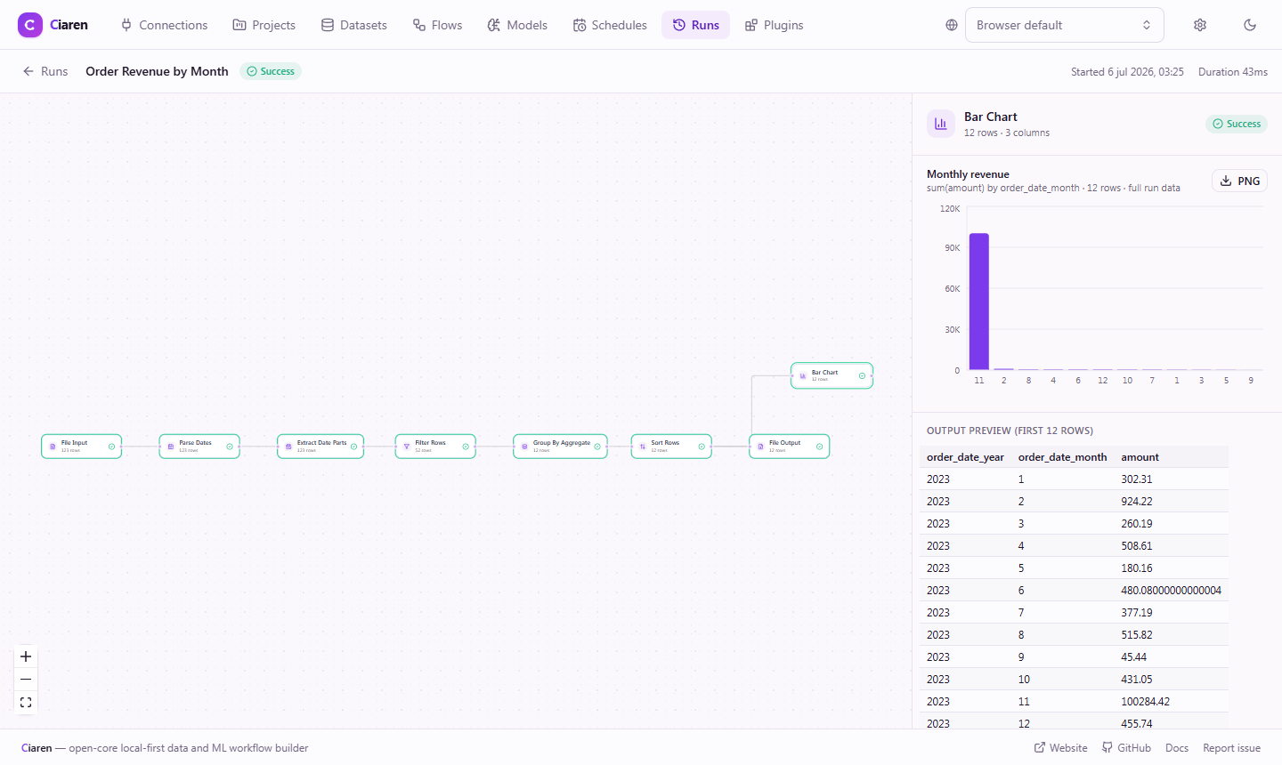
| Preview charts (this page) | Chart nodes | |
|---|---|---|
| Data | Capped preview sample | Every row of the run |
| When | Live, while you edit | At run time |
| Lives | In the editor only | Stored on each run |
| Export | — | PNG with title + legend |
| In the graph | No | Yes — a pass-through node |
Tips
- No chart? Run a preview first. Charts read the node's preview sample, so save the flow and let the preview load.
- Histogram / scatter / correlation need numbers. Non-numeric columns are ignored; cast a text column with Change Types upstream if needed.
- Inspect mid-pipeline. Select an intermediate node (e.g. right after Remove Outliers) to see the effect of a step, not just the final output.
See Also
- Chart nodes — full-data charts stored on runs
- Interface Tour
- Engines (polars / pandas)
- All Transformations